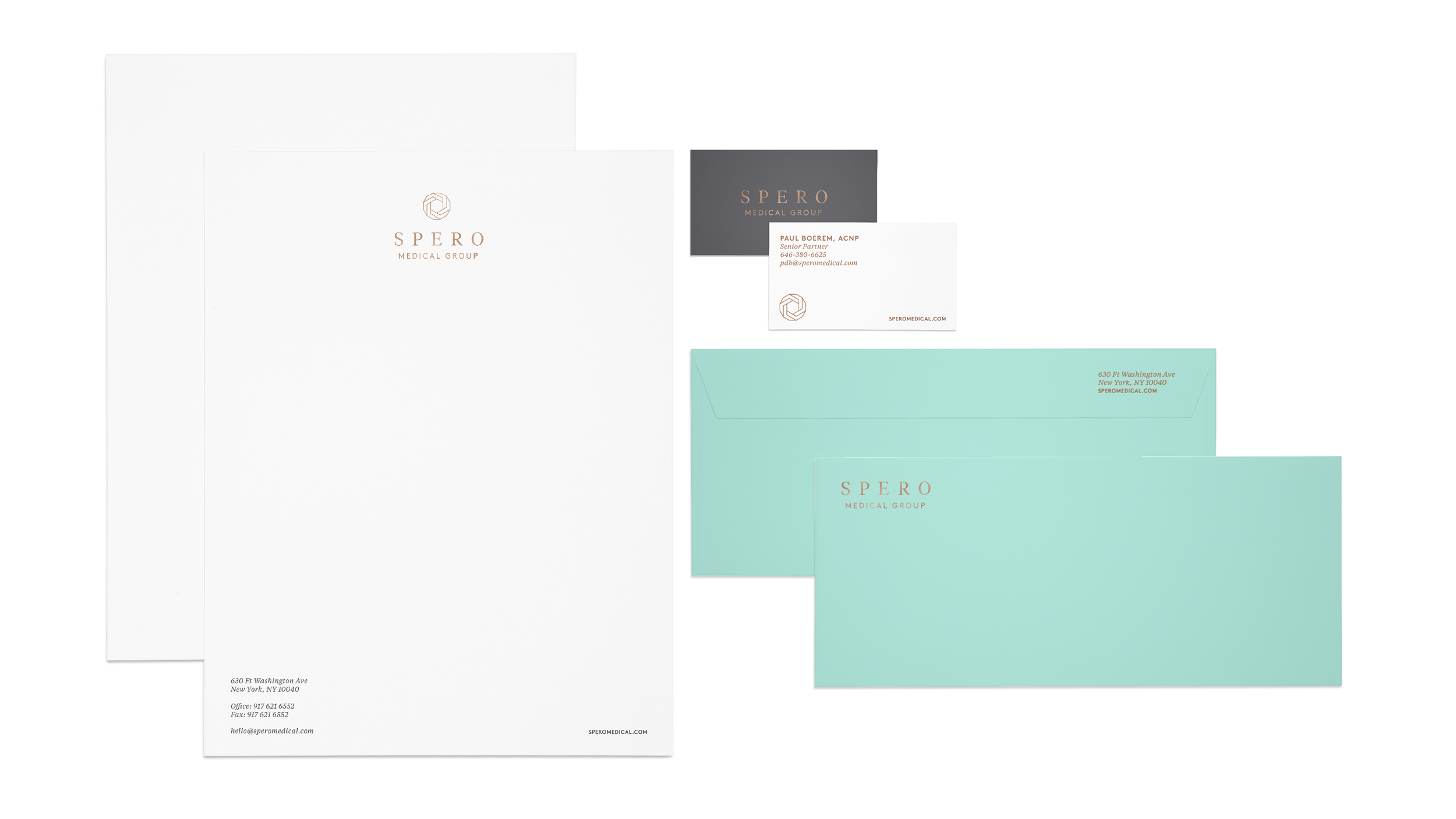
Spero Medical Group
I was approached by a group with an interesting problem, how to make end-of-life care feel elevated and personal. The group was building a brand for a clientele base that was rapidly aging, but have grown accustomed to more personalized care throughout all aspects of their lives. I created a full identity suite, color palette, and brand guidelines for this small upstart. Staying clear of the traditional colors and tonality regularly associated with death, and mourning, I had wanted this to feel more like the individual was enveloped with care, attention, and warmth, and the brand assets reflected that. There was also a lot of exploration around different marks, and naming associated with building this brand. Each of which was a play off the same concept of being encircled by those you love.


